Global Administrator Dashboard
Overview
The Global Administrator Dashboard provides comprehensive insights into your organization's timesheet data, project performance, and team productivity metrics. This centralized control panel enables you to monitor working hours, track billable activities, analyze team utilization, and oversee project progress across your entire organization.
Key capabilities include:
- Monitor total working hours and billable hours across your organization
- Track team utilization percentages and active project counts
- Analyze billable versus working hours trends through interactive charts
- View average billable hours patterns over time
- Manage project watchlists with up to 5 selected projects
- Review pending timesheet approvals by project and month
- Apply flexible filtering by status and time periods
- Access custom date range selections for detailed analysis
Accessing the Dashboard
Global Administrator : Full access to all dashboard features including KPI metrics, charts, project watchlists, and pending approval data.
How to Access
- Log into your Saralflow account using your Global Administrator credentials
- Navigate to the Dashboard section from the main menu
- View the Global Administrator Dashboard which loads automatically with default settings
Pro Tip
The dashboard automatically loads with "Last 3 Months" and "Approved" status filters applied by default for optimal performance.
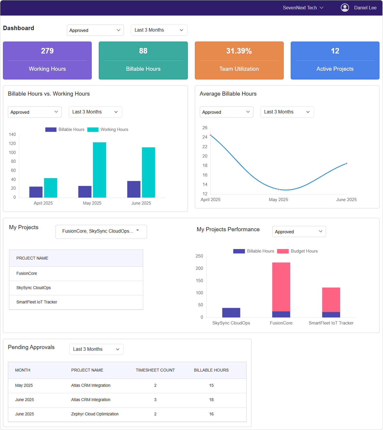
Dashboard Components
KPI Cards Overview
The dashboard displays four key performance indicator cards at the top:
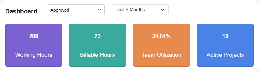
Working Hours Card
- Shows total working hours for the selected time period and status
- Updates dynamically based on your filter selections
- Displays rounded whole numbers for clarity
Billable Hours Card
- Shows total billable hours for the selected time period and status
- Reflects time that can be charged to clients or projects
- Updates automatically when filters are changed
Team Utilization Card
- Shows team utilization percentage (up to 2 decimal places)
- Calculated as billable hours divided by working hours
- Helps assess team efficiency and productivity
Active Projects Card
- Displays the count of currently active projects
- Shows all projects with active status across the organization
- Updates in real-time when project statuses change
Chart Visualizations
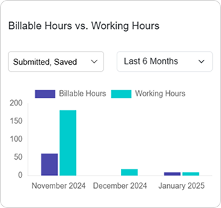
Billable Hours vs Working Hours Chart
- Bar chart comparing billable and working hours by month
- Color-coded bars: Purple for Billable Hours, Teal for Working Hours
- Months are sorted chronologically for easy trend analysis
- Supports independent filtering for customized views
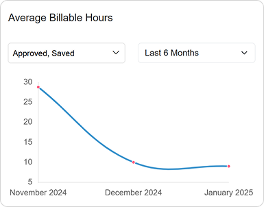
Average Billable Hours Chart
- Line chart showing average billable hours trends over time
- Helps identify patterns and seasonal variations
- Blue line with smooth curves for better readability
- Grid lines are hidden for cleaner visualization
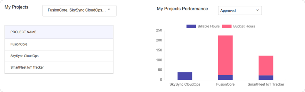
My Projects Performance Chart
- Stacked bar chart showing billable hours vs budget hours for selected projects
- Purple bars represent billable hours, Red bars represent budget hours
- Only displays data for projects in your watchlist
- Helps track project progress against allocated budgets
Project Management Section
My Projects Dropdown
- Multi-select dropdown to choose up to 5 projects for your watchlist
- Projects are sorted alphabetically for easy navigation
- Automatically saves your selections to the database
- Selected projects appear in the table below the dropdown
Project Watchlist Table
- Displays your selected projects in a clean table format
- Shows project names for quick reference
- Updates immediately when you modify your project selections
- Limited to 5 projects maximum for focused monitoring
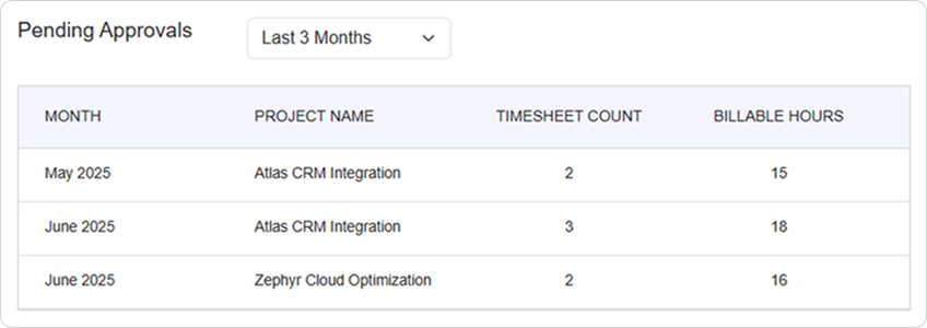
Pending Approvals Table
Approval Overview
- Shows pending timesheet approvals organized by month and project
- Displays month name, project name, timesheet count, and billable hours
- Data is sorted chronologically by month and year
- Helps identify approval bottlenecks and workload distribution
Filter Options
Status Filters
Each dashboard section includes independent status filtering:
Available Status Options:
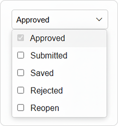
- Approved: Timesheets that have been approved by supervisors
- Submitted: Timesheets submitted for approval but not yet processed
- Saved: Draft timesheets saved but not submitted
- Rejected: Timesheets that were rejected and need revision
- Reopen: Previously approved timesheets that were reopened
How to Use Status Filters
- Click the status dropdown in any dashboard section
- Select or deselect status options using checkboxes
- At least one status must remain selected
- Multiple statuses can be selected simultaneously
- The dashboard updates automatically when you change selections
- Each section maintains independent status filter settings
Note
You cannot deselect all status options. At least one status must remain selected for data to display.
Time Period Filters
Available Time Periods:
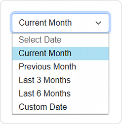
- Current Month: Shows data for the current calendar month
- Previous Month: Shows data for the previous calendar month
- Last 3 Months: Shows data for the past three months (default setting)
- Last 6 Months: Shows data for the past six months
- Custom Date: Allows you to specify exact start and end dates
How to Use Time Period Filters
- Click the time period dropdown in any dashboard section
- Select your desired time range
- For Custom Date selection:
- Choose "Custom Date" from the dropdown
- Use the date range picker that appears
- Select start date and end date
- Click outside the picker to apply changes
- The section updates automatically with new data
Custom Date Range
When using custom date ranges, ensure your end date is after your start date. Invalid date ranges may cause data loading issues.
Using Dashboard Features
Monitoring KPI Metrics
Setting Up KPI Monitoring
- Select appropriate status filters at the top of the dashboard
- Choose your preferred time period using the time period dropdown
- Apply custom date ranges if needed for specific reporting periods
- Monitor the four KPI cards for key metrics:
- Total working hours across your organization
- Total billable hours for client work
- Team utilization percentage
- Count of active projects
Interpreting KPI Data
✅ **High Team Utilization (80%+):**
- Indicates efficient use of working time
- Shows strong billable hour conversion
- Suggests good project allocation

🔍 **Low Team Utilization (Below 60%):**
- May indicate non-billable work or training time
- Could suggest need for more client projects
- Might reflect administrative or internal tasks
Analyzing Chart Data
Working with Bar Charts
- Apply filters specific to the chart section
- Observe monthly trends in the bar chart visualization
-
Compare billable vs working hours for each month
-
Identify patterns such as:
- Months with higher billable ratios
- Seasonal variations in work patterns
- Growth or decline trends over time
Using Line Chart Analysis
- Set appropriate filters for the line chart section
- Track average billable hours trends over the selected period
- Look for patterns such as:
- Consistent monthly averages
- Seasonal fluctuations
- Upward or downward trends
Managing Project Watchlists
Adding Projects to Watchlist
- Click the project multi-select dropdown in the My Projects section
- Search or scroll through the alphabetically sorted project list
- Select up to 5 projects you want to monitor
- Projects are automatically saved to your watchlist preferences
- View selected projects in the table below the dropdown
Monitoring Project Performance
- Review the stacked bar chart showing billable vs budget hours
- Apply status filters to focus on specific timesheet statuses
- Identify projects that are:
- Over budget (billable hours exceed budget)
- Under-utilized (billable hours well below budget)
- On track (balanced billable and budget hours)
Project Selection Limit
You can select a maximum of 5 projects for your watchlist. Attempting to select more will remove the most recently selected project and display a warning message.
Reviewing Pending Approvals
Accessing Approval Data
-
Use the time period filter in the Pending Approvals section
-
Review the approval table showing:
- Month and year of pending timesheets
- Project names requiring approvals
- Count of pending timesheet entries
- Total billable hours awaiting approval
Managing Approval Workflow
🎯 **Approval Priority:**
1. Focus on months with highest billable hours pending
2. Address projects with most pending timesheet counts
3. Review oldest pending approvals first
4. Monitor for approval bottlenecks by project

📋 **Regular Approval Tasks:**
- Check pending approvals weekly
- Coordinate with project administrators for reviews
- Monitor approval patterns for process improvements
- Track approval turnaround times
Best Practices
Dashboard Usage Guidelines
✅ **Do:**
- Review KPI metrics daily for organizational overview
- Use consistent time periods for comparative analysis
- Apply appropriate status filters for accurate reporting
- Monitor project watchlists for budget management
- Check pending approvals regularly to avoid delays

❌ **Don't:**
- Select too many status types if you need focused data
- Use extremely wide date ranges that may slow performance
- Ignore pending approvals for extended periods
- Exceed the 5-project limit for watchlist management
Monitoring and Analysis
🎯 **Regular Monitoring:**
1. Start each day by reviewing KPI cards for organizational health
2. Check pending approvals to identify workflow bottlenecks
3. Monitor project performance charts for budget tracking
4. Analyze trends using consistent time period comparisons

📋 **Weekly Analysis Tasks:**
- Compare current week performance to previous periods
- Review team utilization trends for resource planning
- Update project watchlists based on priority changes
- Export data for detailed offline analysis if needed
Filter Strategy
🔍 **Effective Filtering:**
- Use "Approved" status for final performance metrics
- Include "Submitted" for pending work visibility
- Apply "Last 3 Months" for trend analysis
- Use custom dates for specific reporting periods
- Combine multiple statuses for comprehensive overviews
Troubleshooting
Common Issues and Solutions
1. Dashboard Loading Issues
Problem: Dashboard takes too long to load or displays no data
Possible Causes & Solutions:
🔍 **Check Data Filters:**
- Verify at least one status is selected in each section
- Ensure date ranges are valid (start date before end date)
- Try reducing the time period scope for faster loading

🔄 **Alternative Actions:**
- Browser refresh (Ctrl+F5 / Cmd+Shift+R)
- Clear browser cache if needed
- Check your internet connection stability
2. Chart Display Problems
Problem: Charts appear empty or show incorrect data
Possible Causes & Solutions:
🔍 **Verify Filter Settings:**
- Confirm appropriate status filters are selected
- Check that the time period contains data
- Ensure projects in watchlist have timesheet entries

🔄 **Data Refresh Steps:**
- Change and reapply filters to refresh data
- Select different time periods to verify data exists
- Contact administrator if data appears missing
3. Project Selection Issues
Problem: Cannot select projects or selection doesn't save
Possible Causes & Solutions:
🔍 **Check Selection Limits:**
- Verify you haven't exceeded 5-project maximum
- Ensure projects are active and accessible
- Confirm you have appropriate permissions

🔄 **Resolution Steps:**
- Remove existing projects before adding new ones
- Try selecting projects one at a time
- Refresh the page and retry selection
4. Filter Inconsistencies
Problem: Different dashboard sections show conflicting data
Possible Causes & Solutions:
🔍 **Review Filter Independence:**
- Each section maintains separate filter settings
- Status selections may differ between sections
- Time periods might vary across dashboard components

🔄 **Standardization Actions:**
- Apply consistent filters across all sections
- Document your standard filter preferences
- Use custom date ranges for precise comparisons
Performance Optimization
For Better Dashboard Performance:
| Issue | Solution |
|---|---|
| Slow loading times | Use shorter time periods (1-3 months) |
| Chart rendering delays | Reduce number of selected statuses |
| Browser responsiveness | Close unnecessary browser tabs |
| Data refresh issues | Use browser refresh rather than filter changes |
Conclusion
The Global Administrator Dashboard serves as your central command center for monitoring organizational timesheet performance, tracking team productivity, and managing project oversight. By effectively utilizing the KPI cards, interactive charts, project watchlists, and filtering capabilities, you can maintain clear visibility into your organization's time management and project progress.
Regular dashboard monitoring combined with strategic use of filters and project selection will help you identify trends, manage approvals efficiently, and make data-driven decisions for optimal organizational performance.
Last Updated: September 17, 2025 Version: 1.0 Document Type: End User Guide