Project Dashboard
Overview
The Project Dashboard provides comprehensive analytics and performance metrics for individual projects within the SaralFlow timesheet management system. This powerful tool enables project managers and team leaders to monitor project progress, track resource utilization, and analyze team performance through interactive charts and key performance indicators.
Key capabilities include:
- Real-time project performance metrics and KPIs
- Interactive data visualization with multiple chart types
- Team utilization tracking and analysis
- Budget and resource monitoring
- Flexible time period filtering options
- Status-based data filtering for detailed insights
Accessing the Project Dashboard
Navigation Path
-
From Project List Page Navigate to the main project listing page from your dashboard or navigation menu.
-
Select Specific Project Click on any project from the project list to open the project details page.
-
Access Dashboard Tab You will see two tabs:
Project OverviewandProject Dashboard. Click on theProject Dashboardtab to access the dashboard.
User Permissions
The Project Dashboard is accessible to the following user roles:
- Global Administrator : Full access to all project dashboards across the system
- Team Leaders : Access to dashboards for projects they are assigned to lead
Note
The Project Dashboard operates at an individual project level, meaning each project has its own dedicated dashboard with project-specific data and metrics.
Dashboard Overview
Key Performance Indicators (KPIs)
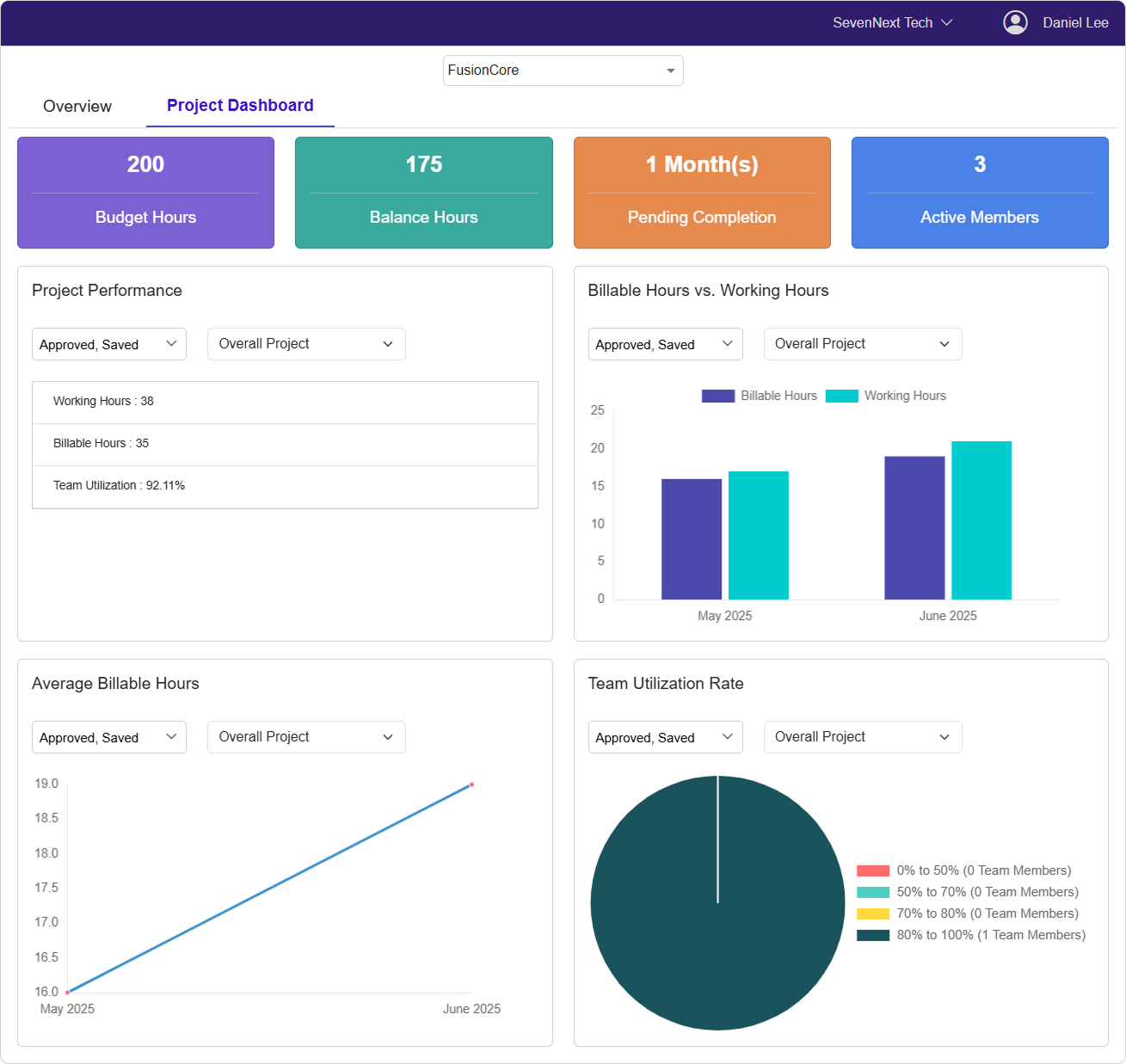
The dashboard displays four primary KPI cards at the top:
Budget Hours
- Shows the total allocated budget hours for the project
- Displays as a large numerical value for quick reference
- Helps track overall project scope
Balance Hours
- Indicates remaining hours available in the project budget
- Calculated as: Budget Hours - Used Hours
- Critical for resource planning and project timeline management
Pending Completion
- Shows estimated months remaining until project completion
- Displayed in format: "X Month(s)"
- Based on project end date compared to current date
Active Members
- Displays current count of active team members
- Represents users currently allocated to the project
- Helps with team size monitoring
Data Visualization Components
The dashboard features four main analytical components:
- Project Performance Table
- Billable Hours vs Working Hours Chart
- Average Billable Hours Trend
- Team Utilization Rate Distribution
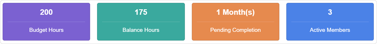
Project Performance Analytics
Project Performance Table
This section displays key performance metrics in a table format:
- Working Hours : Total hours logged by the team
- Billable Hours : Hours that can be billed to the client
- Team Utilization : Overall team efficiency percentage
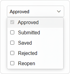
Data Filtering Options
Status Filter: Select from multiple timesheet statuses
- APPROVED: Finalized and approved entries
- SUBMITTED: Entries awaiting approval
- SAVED: Draft entries not yet submitted
- REJECTED: Entries that require revision
- REOPEN: Previously approved entries that were reopened
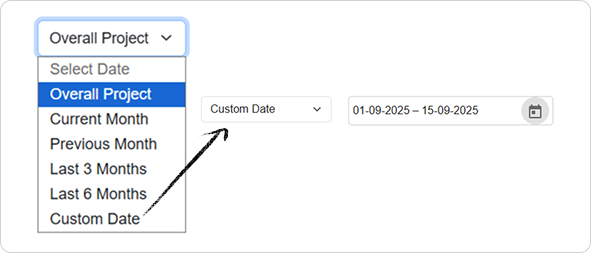
Time Period Selection
Available Options:
- Overall Project: Complete project duration
- Current Month: Present month data
- Previous Month: Last month's data
- Last 3 Months: Three-month rolling period
- Last 6 Months: Six-month rolling period
- Custom Date: User-defined date range
Custom Date Range
When you select "Custom Date," additional date picker fields appear:
- Select
Start Dateusing the calendar picker - Select
End Dateusing the calendar picker - Data updates automatically based on your selection
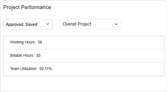
Billable Hours vs Working Hours Analysis
Chart Overview
This bar chart compares billable hours against total working hours across different time periods, providing insights into billing efficiency and project profitability.
Chart Features
- Purple bars represent Billable Hours
- Teal bars represent Working Hours
- X-axis shows time periods (months)
- Y-axis shows hour quantities
How to Use This Chart
-
Analyze Billing Efficiency Compare the height of purple (billable) vs teal (working) bars to assess how much work can be billed to clients.
-
Identify Trends Look for patterns across months to spot improvements or declining billing ratios.
-
Resource Planning Use data to make informed decisions about resource allocation and project pricing.
Data Filtering
- Apply the same status and time period filters as the Project Performance section
- Data updates dynamically based on your filter selections
- Use custom date ranges for specific analysis periods
Average Billable Hours Trend
Line Chart Analysis
This line chart shows the trend of average billable hours over time, helping you understand project billing patterns and team productivity trends.
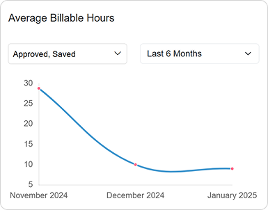
Chart Interpretation
- Blue line represents average billable hours per time period
- Upward trends indicate increasing billing efficiency
- Downward trends may signal need for process improvements
- Flat lines suggest consistent performance levels
Strategic Insights
🎯 **Performance Tracking:**
- Monitor month-over-month improvements
- Identify seasonal patterns in productivity
- Set benchmarks for future projects

📋 **Planning Applications:**
- Forecast future billing capacity
- Adjust resource allocation strategies
- Validate project timeline estimates
Team Utilization Rate Distribution
Pie Chart Overview
This pie chart visualizes how team members are distributed across different utilization rate ranges, providing insights into team efficiency and workload balance.
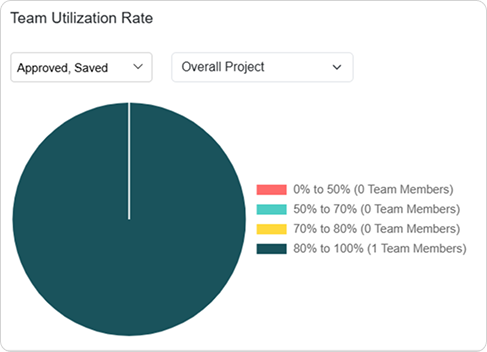
Utilization Categories
The chart divides team members into four utilization ranges:
- 0% to 50% : Under-utilized team members (Red)
- 50% to 70% : Moderate utilization (Teal)
- 70% to 80% : Good utilization (Yellow)
- 80% to 100% : High utilization (Dark Teal)
Chart Labels
Each segment displays: - Utilization percentage range - Number of team members in that range - Example: "70% to 80% (3 Team Members)"
Analysis Guidelines
✅ **Optimal Distribution:**
- Majority of team members in 70-80% range
- Minimal members in 0-50% range
- Few members consistently at 80-100%

❌ **Warning Signs:**
- Many members in 0-50% range (underutilization)
- Excessive members at 80-100% (potential burnout)
- Uneven distribution across ranges
Data Filtering and Customization
Status-Based Filtering
All dashboard components support status-based filtering to analyze different types of timesheet entries:
How to Apply Status Filters
-
Click the Status Dropdown Each chart section has its own status filter dropdown.
-
Select Multiple Statuses Use checkboxes to select one or multiple timesheet statuses.
-
Apply Changes Data refreshes automatically when you change selections.
-
Minimum Selection At least one status must remain selected at all times.
Pro Tip
Use different status combinations to analyze workflow efficiency. For example, compare "APPROVED" vs "SUBMITTED" data to understand approval bottlenecks.
Time Period Filtering
Preset Time Periods
🔄 **Quick Selections:**
- Overall Project: Complete project timeline
- Current Month: Real-time current month data
- Previous Month: Last month's complete data
- Last 3 Months: Rolling three-month period
- Last 6 Months: Rolling six-month period
Custom Date Range Setup
-
Select "Custom Date" Option Choose this from the time period dropdown.
-
Set Start Date Click the start date field and select from calendar.
-
Set End Date Click the end date field and select from calendar.
-
Automatic Update Charts refresh immediately upon date selection.
Filter Independence
Note
Each dashboard component (Project Performance, Bar Chart, Line Chart, Pie Chart) maintains independent filter settings. You can analyze different time periods and statuses simultaneously across different charts.
Data Interpretation Guidelines
Understanding Metrics
Budget vs Balance Hours
📊 **Healthy Project Indicators:**
- Balance Hours > 20% of Budget Hours
- Steady decrease in Balance Hours over time
- Balance Hours align with project timeline

⚠️ **Warning Indicators:**
- Balance Hours < 10% of Budget Hours
- Rapid depletion of Balance Hours
- Negative Balance Hours (over budget)
Team Utilization Analysis
🎯 **Optimal Utilization Patterns:**
- Average team utilization: 70-85%
- Even distribution across team members
- Consistent utilization over time

🔍 **Areas for Investigation:**
- Members consistently below 50% utilization
- Members consistently above 90% utilization
- Large variations between team members
Trend Analysis
Billable Hours Trends
- Increasing Trend : Improving efficiency and profitability
- Decreasing Trend : May indicate scope creep or inefficiencies
- Stable Trend : Consistent performance, predictable outcomes
Working Hours Patterns
- Seasonal Variations : Normal for many project types
- Sudden Spikes : May indicate crunch periods or issues
- Gradual Increases : Could suggest scope expansion
Best Practices and Recommendations
Regular Monitoring Schedule
🔄 **Weekly Reviews:**
- Check KPI cards for budget status
- Review current month performance
- Monitor team utilization balance

📋 **Monthly Analysis:**
- Analyze billing efficiency trends
- Review previous month completion
- Plan resource adjustments

🎯 **Quarterly Planning:**
- Use 3-6 month data for strategic planning
- Identify long-term performance patterns
- Set improvement targets for next quarter
Data-Driven Decision Making
Resource Allocation
-
Identify Underutilized Resources Use the pie chart to find team members with low utilization rates.
-
Balance Workloads Redistribute tasks from over-utilized to under-utilized team members.
-
Timeline Adjustments Use pending completion data to adjust project timelines proactively.
Budget Management
✅ **Do:**
- Monitor balance hours weekly
- Compare billable vs working hours ratios
- Track utilization trends consistently
- Use custom date ranges for detailed analysis

❌ **Don't:**
- Wait until balance hours are critically low
- Ignore consistent underutilization patterns
- Make decisions based on single data points
- Overlook status filter impacts on data accuracy
Troubleshooting Common Issues
1. No Data Available Messages
Problem: Charts showing "Data not available" messages
Possible Causes & Solutions:
🔍 **Check Date Ranges:**
- Verify selected time period contains timesheet data
- Ensure custom date ranges are reasonable
- Check if project was active during selected period

🔄 **Verify Status Filters:**
- Confirm at least one relevant status is selected
- Try selecting "APPROVED" status for most reliable data
- Check if team has submitted timesheets for selected period
2. Inconsistent Data Across Charts
Problem: Different charts showing varying results for same period
Possible Causes & Solutions:
🔍 **Filter Settings:**
- Each chart maintains independent filters
- Verify time period settings match across charts
- Ensure status selections are consistent where needed

🔄 **Data Synchronization:**
- Refresh page if data appears outdated
- Clear browser cache if needed (Ctrl+F5 / Cmd+Shift+R)
3. Performance Issues
Problem: Dashboard loading slowly or charts not updating
Possible Causes & Solutions:
🔄 **Browser Actions:**
- Browser refresh (Ctrl+F5 / Cmd+Shift+R)
- Clear browser cache if needed
- Try different time period to reduce data load

🔍 **Data Volume:**
- Use shorter time periods for faster loading
- Apply specific status filters to reduce data volume
- Consider using preset periods instead of custom ranges
4. Permission Access Issues
Problem: Cannot access Project Dashboard
Solution:
🔐 **Role Verification:**
- Confirm you have Team Leader or Global Administrator role
- Verify you are assigned to the specific project
- Contact system administrator if access should be available
Success Indicators and Performance Metrics
Project Health Indicators
✅ **Healthy Project Metrics:**
- Billable hours ratio above 70%
- Team utilization between 70-85%
- Balance hours decreasing predictably
- Consistent performance trends

📈 **Improvement Indicators:**
- Increasing billable hours trend
- Improving team utilization distribution
- Reducing time-to-approval cycles
- Stable or improving efficiency ratios
Success Confirmation Workflow
Daily Monitoring : Quick KPI card review (2-3 minutes)
✅ Budget status check
🔄 Active member count verification
📊 Current utilization overview
Weekly Analysis : Detailed chart review (10-15 minutes)
✅ Billable vs working hours analysis
📧 Team utilization distribution review
🔄 Trend identification and planning
Conclusion
The Project Dashboard serves as a comprehensive command center for project oversight and management. By leveraging its real-time analytics, interactive visualizations, and flexible filtering capabilities, project managers can make informed decisions that drive project success. Regular monitoring of key metrics, combined with data-driven insights, enables proactive project management and optimal resource utilization.
The dashboard's ability to provide both high-level KPIs and detailed analytical views makes it an essential tool for maintaining project health, ensuring budget compliance, and maximizing team productivity throughout the project lifecycle.
Last Updated: September 17, 2025 Version: 1.0 Document Type: End User Guide